
5.06 Linear regression
Ideas
Linear regression
Exploration
Is there a relationship between the years since purchased and the value in thousands of dollars? Explain.
Which of the lines on the graph is the line of best fit?
A line of best fit (or trend line) is a straight line that best represents the data on a scatterplot. We can use lines of best fit to help us make predictions or conclusions about the data.
We previously approximated a line of best fit by trying to balance the number of points above the line with the number of points below the line. This can result in multiple different models.
In the context of a line of best fit, the slope-intercept form represents
For example, this graph models a plant's growth over several weeks.
Besides the slope (m) and y-intercept (b), technology used for linear regression also gives us the correlation coefficient. We use the letter r to represent it. The correlation coefficient is always a number between -1 and 1. It tells us two things about the linear relationship between the variables: its strength and its direction.
Here's how to interpret the value of r:
The sign of r indicates the direction of the association.
A positive r value means a positive association (as x increases, y tends to increase).
A negative r value means a negative association (as x increases, y tends to decrease).
The magnitude (the absolute value) of r indicates the strength of the linear association.
Values close to 1 or -1 indicate a strong linear relationship (points lie close to the line of best fit).
Values close to 0 indicate a weak or no linear relationship (points are scattered far from the line).
Values between 0.5 and 0.8 (or between -0.5 and -0.8) usually mean a moderately strong linear relationship.
It's important to remember that correlation does not imply causation. A strong correlation between two variables doesn't necessarily mean that one variable causes the change in the other.
When using technology like Desmos or a graphing calculator for linear regression (often by entering y_1 \sim mx_1 + b), the output will usually include the value of r along with the parameters m and b.
These terms describe the range in which we make predictions:
Interpolation: Prediction within the range of x-values in the data
Extrapolation: Prediction outside the range of x-values in the data


Using the previous example of the plant height over time:
The reliability of predictions depends on the strength of the relationship, whether the data is interpolated or extrapolated, and the number of points in the data set.
A larger sample size generally increases reliability.
The strength of the correlation (r value): Predictions are more reliable when the correlation is strong (|r| is close to 1).
Interpolation vs. Extrapolation:
Interpolation (making predictions for x-values between the smallest and largest x-values in the data) is usually more reliable than extrapolation. This is especially true if the correlation is strong or moderate.
Extrapolation (making predictions for x-values outside the smallest and largest x-values in the data) gets less reliable the farther we go from the known data. Even with a strong correlation, the straight-line pattern might not continue forever.
Examples
Example 1
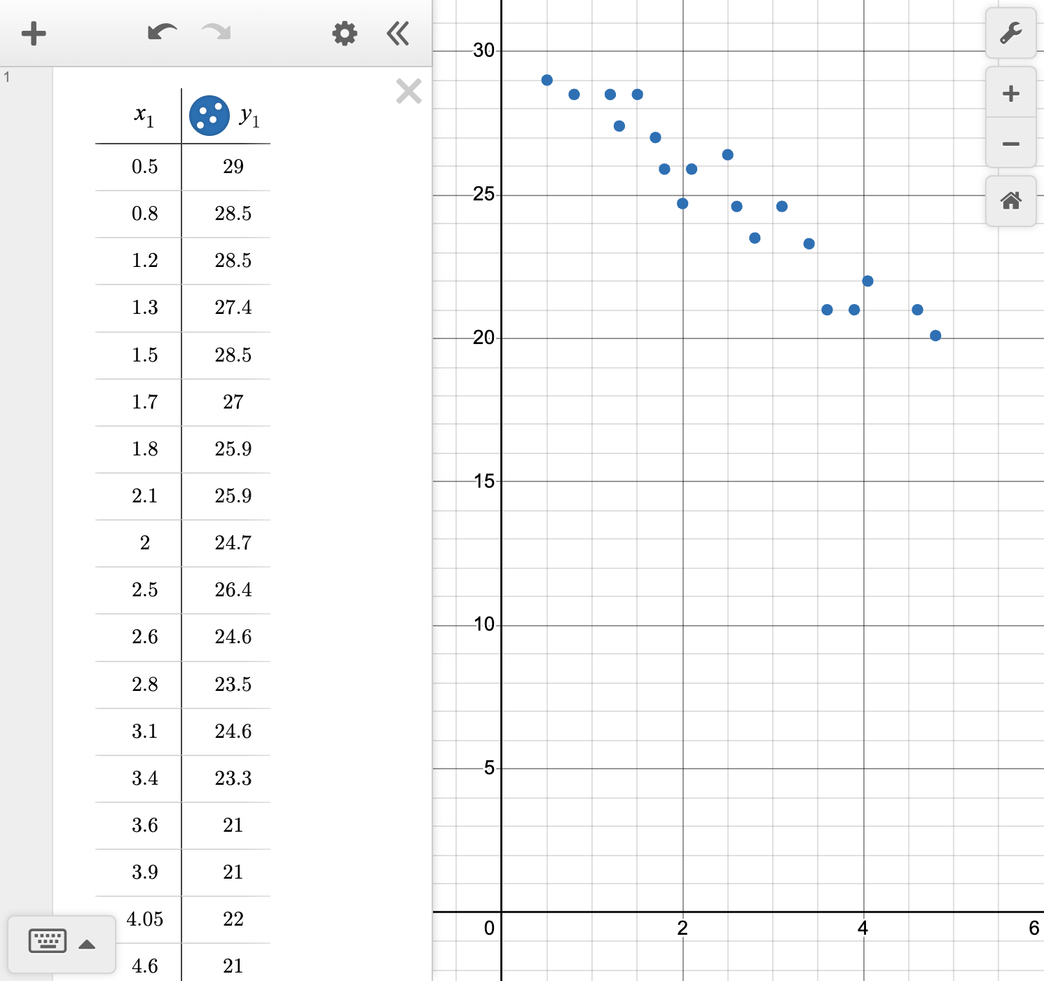
Natalia collected data to answer the question, "What is the relationship between the years since purchasing a car and its value?" Her data is shown in the table.
| Time since purchase (years) | 0.5 | 0.8 | 1.2 | 1.3 | 1.5 | 1.7 | 1.8 | 2.1 | 2 | 2.5 |
|---|---|---|---|---|---|---|---|---|---|---|
| Value (thousands of dollars) | 29 | 28.5 | 28.5 | 27.4 | 28.5 | 27 | 25.9 | 25.9 | 24.7 | 26.4 |
| Time since purchase (years) | 2.6 | 2.8 | 3.1 | 3.4 | 3.6 | 3.9 | 4.05 | 4.6 | 4.8 | |
| Value (thousands of dollars) | 24.6 | 23.5 | 24.6 | 23.3 | 21 | 21 | 22 | 21 | 20.1 |
Find the equation of the line of best fit.
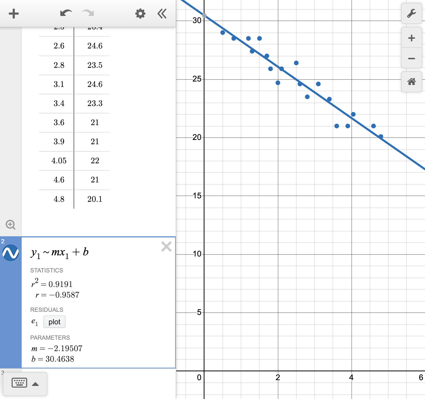
Calculate and interpret the correlation coefficient r for this data.
Interpret the slope and y-intercept of the line.
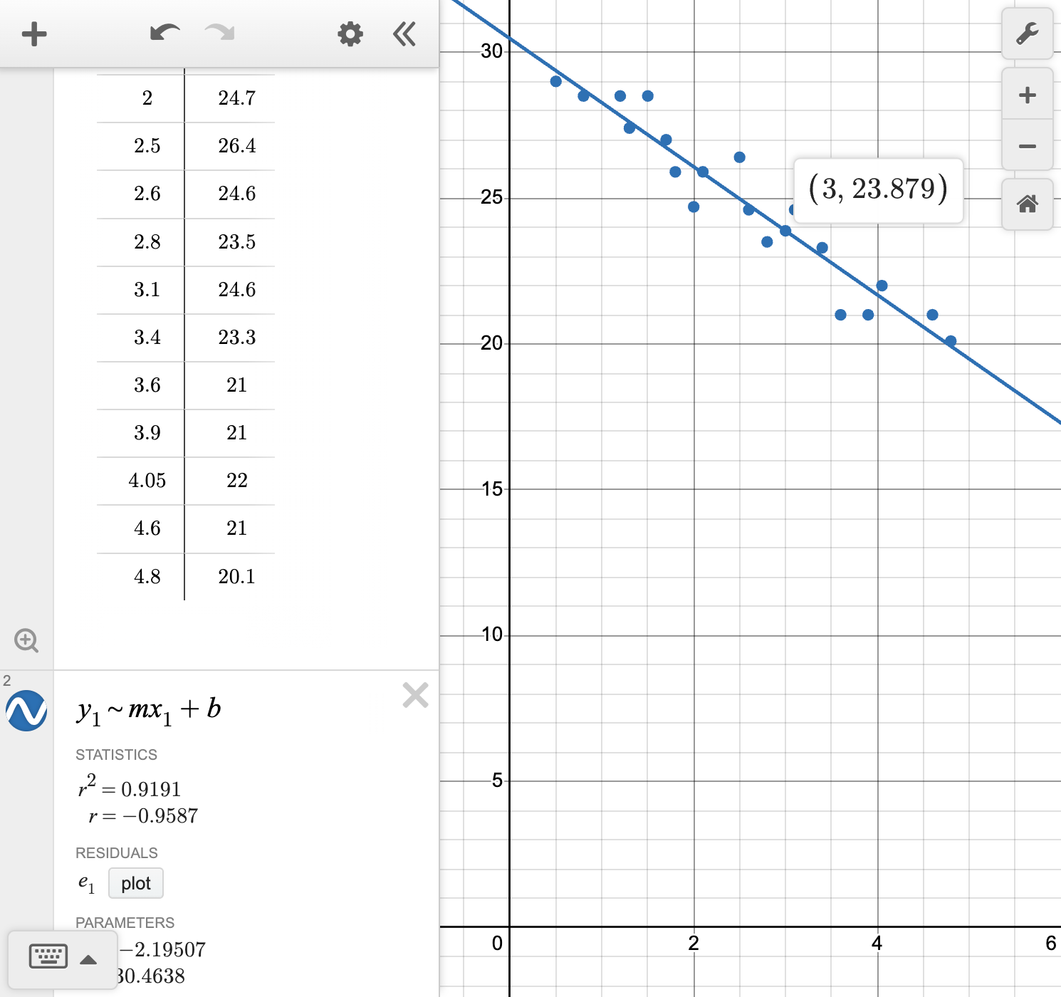
Make a prediction about the value of a car after 3 years.
Make a prediction about the value of a car after 10 years.
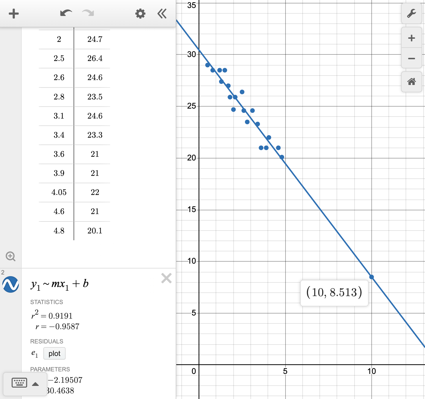
Is the prediction for the car's value after 3 years or after 10 years more reliable?
Example 2
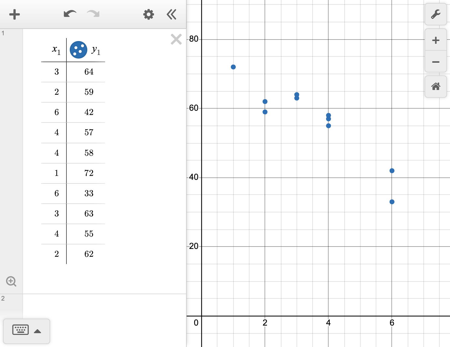
A teacher recorded the number of days since a student last studied for an exam and their score out of a possible 80 points on the exam.
| Days since studying | 3 | 2 | 6 | 4 | 4 | 1 | 6 | 3 | 4 | 2 |
|---|---|---|---|---|---|---|---|---|---|---|
| Exam score | 64 | 59 | 42 | 57 | 58 | 72 | 33 | 63 | 55 | 62 |
Formulate an investigative question that can be answered by the data.
Describe the relationship between the number of days since studying and the exam score.
Calculate the line of best fit using technology.
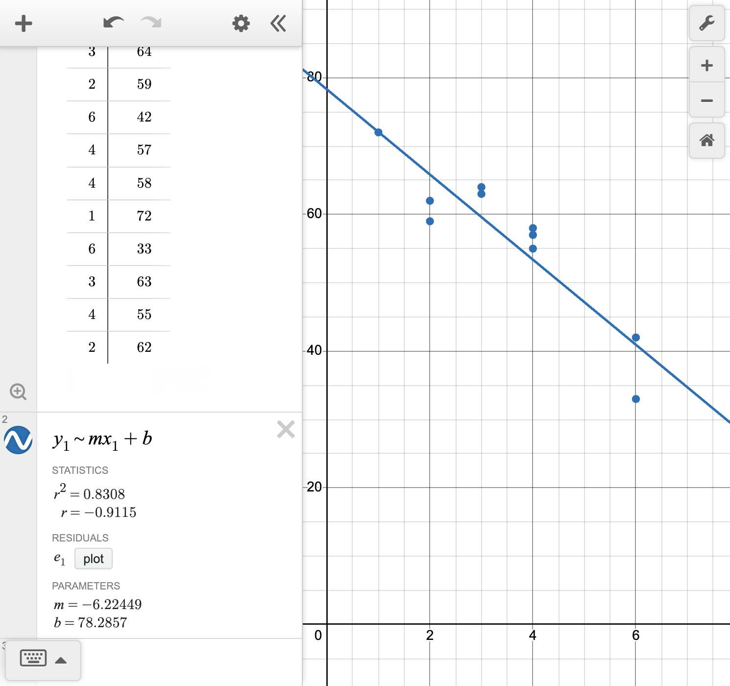
Calculate and interpret the correlation coefficient r for this data.
Answer the question formulated in part (a).
If a student studied the same day as the exam, what would we expect their score to be?
A line of best fit for a set of data can be used to interpret a given situation and make predictions about values not represented by the data.
A line of best fit has an equation of the form y=mx+b. We can use technology to perform the linear regression analysis.
In the context of a line of best fit, the slope-intercept form represents
Technology used for linear regression also provides the correlation coefficient (r), a value between -1 and 1.
r measures the strength and direction of the linear relationship.
Sign indicates direction (positive or negative association).
Value close to 1 or -1 indicates a strong linear relationship; value close to 0 indicates a weak one.
These terms describe the range in which we make predictions:
Interpolation: Prediction within the range of x-values in the data
Extrapolation: Prediction outside the range of x-values in the data
The reliability of predictions depends on several factors, including the strength of the correlation (r), whether the prediction is an interpolation (within the data range) or an extrapolation (outside the data range), and the sample size. Predictions are generally more reliable when the correlation is strong (|r| is close to 1) and when interpolating rather than extrapolating.