topic badge

7.03 Linear, quadratic, and exponential models

Curves of best fit

Bivariate data can be modeled with a curve of best fit, also called a regression model. If the correlation between the variables is linear, a line of best fit can be used to model the data. If the correlation is not linear, the data may be modeled by a curve, such as an exponential or quadratic model.

When choosing a model to represent data and make predictions, we can use what we know about the key features of the functions we have learned so far and match them to the behavior of the data.

10
20
30
40
50
60
70
x
5
10
15
20
25
y

Linear functions can represent data that increases or decreases in a constant manner. Linear functions have infinite domain and range and can have both x and y-intercepts.

0.1
0.2
0.3
0.4
0.5
x
10000
20000
30000
40000
50000
y

Exponential functions can represent data that grows or decays rapidly and levels off around a specific value. Exponential functions have an infinite domain but a restricted range, so it may not have an x-intercept.

10
20
30
40
50
60
70
80
x
5
10
15
20
25
30
35
40
45
y

Quadratic functions can represent data that changes direction smoothly and has a minimum or maximum value. Quadratic functions have an infinite domain, and may or may not have intercepts.

Exploration

Each table shown represents a different set of data.

Table 1
x00.20.40.60.811.21.41.61.8
y13743102369
Table 2
x33.544.555.566.577.58
y63687790104100112120114127127
Table 3
x012345678910
y4556781630376692

Without creating a scatterplot:

  1. What type of function would best model the data in Table 1? Explain your answer.

  2. What type of function would best model the data in Table 2? Explain your answer.

  3. What type of function would best model the data in Table 3? Explain your answer.

The correlation coefficient is used to determine the strength of a linear relationship, but it cannot describe the strength of nonlinear relationships. Instead, we can analyze the coefficient of determination (R^{2}).The value of R^{2} can vary between 0 and 1. The closer the value is to 1, the more accurate the model is.

Examples

Example 1

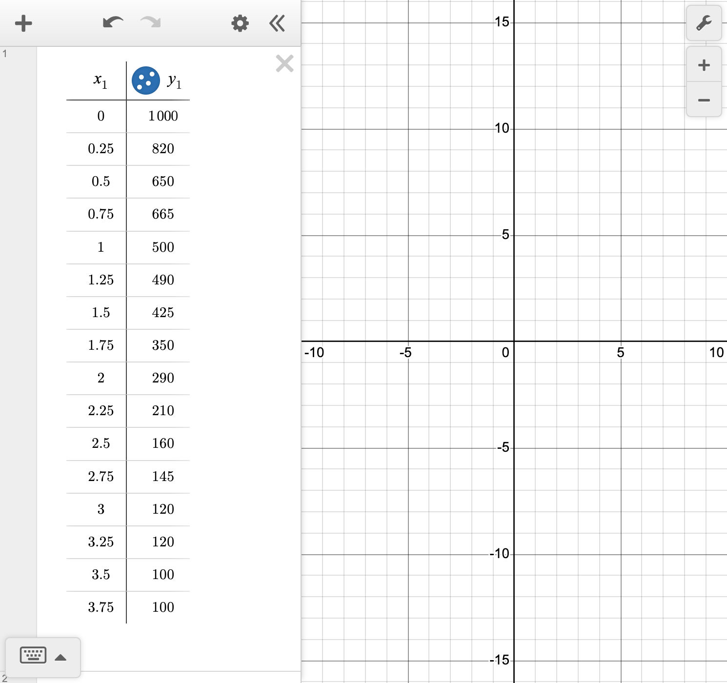
The population of fish in a small lake over time, given in years, is shown in the table:

YearsFish PopulationYearsFish Population
010002290
0.258202.25210
0.56502.5160
0.756652.75145
15003120
1.254903.25120
1.54253.5100
1.753503.75100
a

Determine whether a linear or exponential model best fits the relationship between the years and the population of fish.

Worked Solution
Create a strategy

Use technology to plot the data on a coordinate plane, then examine the shape of the data.

To do this, enter the x- and y-values in two separate columns, then highlight the data and select Two Variable Regression Analysis:

A screenshot of the GeoGebra statistics tool showing how to select the Two Variable Regression Analysis option. Speak to your teacher for more details.
Apply the idea
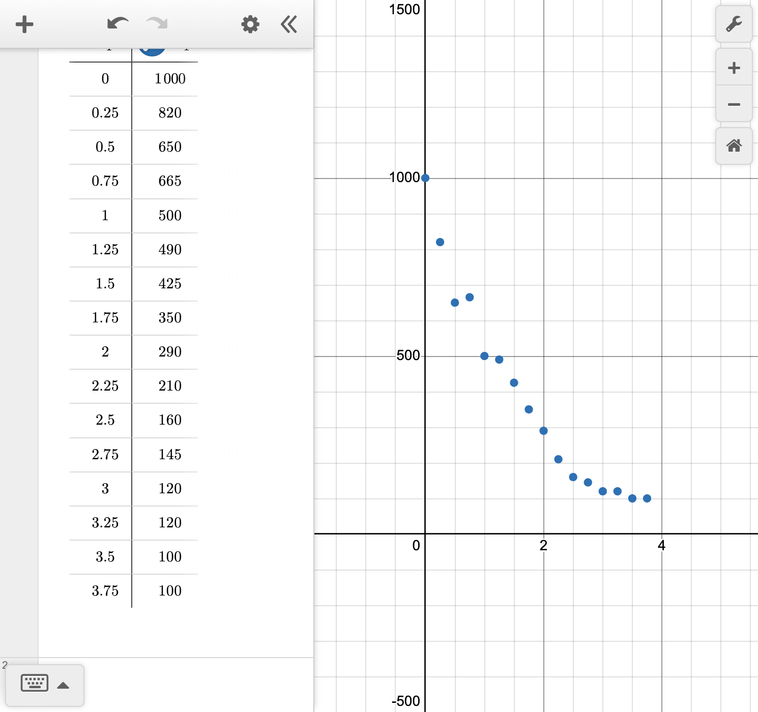
A screenshot of the GeoGebra statistics tool showing how to create the scatterplot of a given data set. Speak to your teacher for more details.

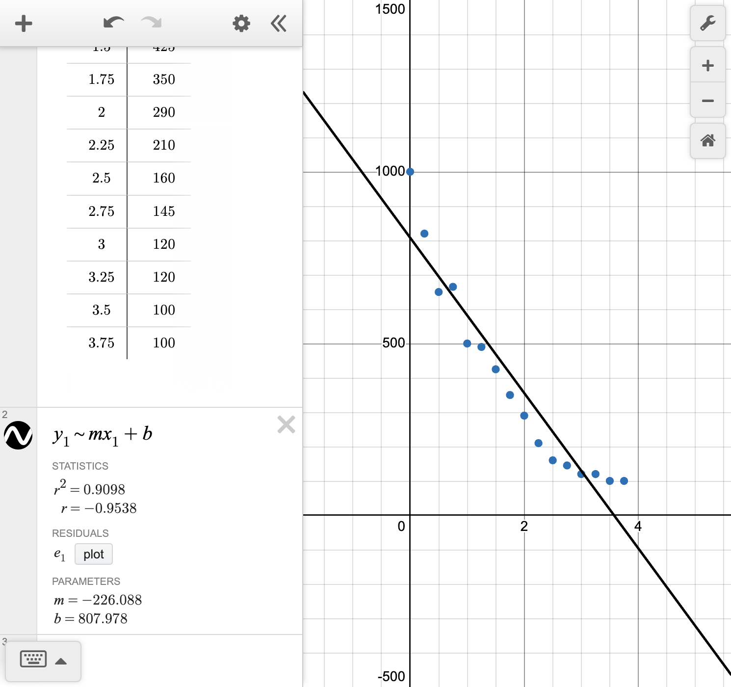
To find the line of best fit, choose Linear under the Regression Model drop down menu:

A screenshot of the GeoGebra statistics tool showing how to display the equation of the line of best fit. Speak to your teacher for more details.

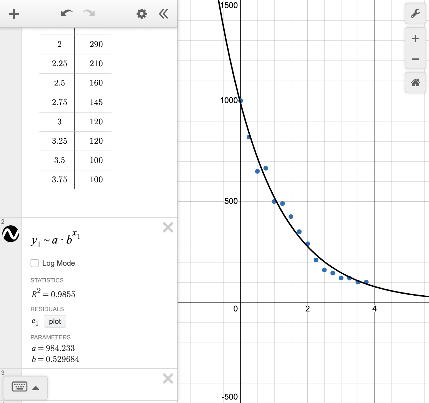
To find the exponential curve of best fit, choose Growth under the Regression Model drop down menu:

A screenshot of the GeoGebra statistics tool showing how to display the equation of the curve of best fit. Speak to your teacher for more details.

The exponential model is a better model of the data because most of the points are tightly clustered around the curve. The linear model does not represent the smallest and largest x-values well.

An exponential model would best fit the data after examining the plot.

Reflect and check

We can also use the correlation coefficient and coefficient of determination to examine the fit of the linear and exponential models.

To examine the fit of the exponential model, click the \Sigma x button to show the statistics and find the coefficient of determination \left(R^2\right). For this curve, R^2=0.9844 which means this curve closely models the actual data.

A screenshot of the GeoGebra statistics tool showing how to display related statistics of a given set of data. Speak to your teacher for more details.

To examine the fit of the linear model, find the correlation coefficient \left(r\right). For this line, r=-0.9538 which shows a strong correlation, but it is not as strong as the exponential model.

A screenshot of the GeoGebra statistics tool showing how to display related statistics of a given set of data. Speak to your teacher for more details.
b

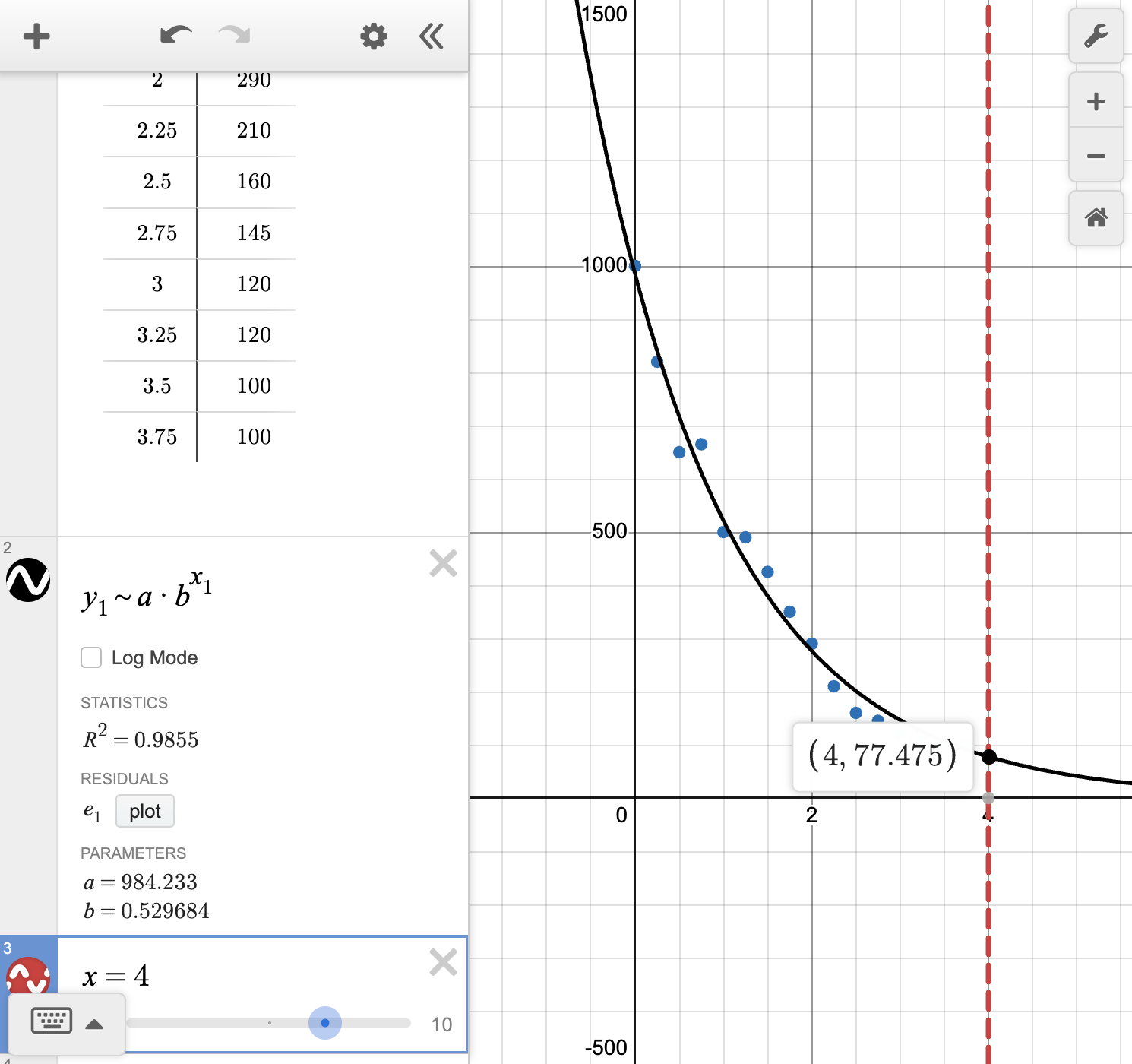
Calculate the regression model for the data and use it to predict the population of fish in the lake after 4 years.

Worked Solution
Create a strategy

Use technology to calculate the exponential regression, then use the equation to determine the population when x=4.

Apply the idea

The function that fits the model best is y=1005.4784\left(0.5161\right)^{x}

If x=4, then \begin{aligned}y&=1005.4784\left(0.5161\right)^{4}\\&=71.3359\end{aligned} According to the regression model, we can expect there to be about 71 fish remaining in the lake after 4 years.

Reflect and check

Remember that the coefficients in the equation for the curve of best fit have been rounded. For that reason, the answer is not 100\% accurate. If we had used technology to make this prediction, we would have gotten a slightly different answer.

A screenshot of the GeoGebra statistics tool showing how to use the scatterplot to predict the value of y given a value of x. Speak to your teacher for more details.

The calculator's answer is more accurate because it includes more decimal values in the coefficients and does not round them to only four place values. However, the differences between these values is small because we used four decimals in the coefficients of the equation.

If we had rounded the coefficients to even fewer decimal places, the answer would have been less accurate.

Example 2

Jocelyn plays on the basketball team and wants to improve her shot. She notices that she is really good at making shots from certain distances, but she is not as good at making shots from other distances. She decides to investigate this further using the data cycle.

a

Formulate a statistical question that Jocelyn can use to investigate the relationship between the shots she makes and the distance she is from the hoop.

Worked Solution
Create a strategy

We can assume that Jocelyn is investigating the relationship between the shots she makes and the distance she is from the hoop because she wants to improve her game. There are many statistical questions we can ask, but we should focus the question around the purpose of the investigation.

Apply the idea

One possible statistical question is, "At what distances does Jocelyn make less than half of her shots?"

Reflect and check

Other possible questions are:

  • How does the percentage of shots Jocelyn makes change with the distance from the hoop?

  • If Jocelyn is at the three point line, what percent of shots can we expect her to make?

  • How far is Jocelyn from the hoop when she makes most of her shots?

b

Describe a method Jocelyn can use to collect the data.

Worked Solution
Create a strategy

Jocelyn needs to collect data on two variables: the distance she is from the hoop and the number or percent of shots she makes from that distance.

Bivariate data can be collected by:

  • acquiring data through research

  • collecting data using surveys, observations, scientific experiments, polls, or questionnaires

Jocelyn will need to collect the data herself, rather than acquiring it through research. She cannot collect the data through a survey, poll, or questionnaire either. The only variable Jocelyn is interested in controlling is the distance from the hoop, so she does not need to use a scientific experiment.

Apply the idea

Jocelyn can use a systematic observation to collect this data. One way to do this would be to draw arcs that are various distances from the hoop (such as 2\text{ ft} from the hoop, 3\text{ ft} from the hoop, etc.). Then, she can shoot a large number of shots from each of the distances and keep track of how many she made from each distance.

To get a random sample, she should not take consecutive shots from the same distance or same side of the hoop. For example, rather than taking 10 consecutive shots from the free throw line, she should take a few shots from the left or right side of the hoop that is the same distance as the free throw line. This will help the data be more representative of how she shoots in general.

c

Jocelyn collected data on the percentage of shots she made from various distances. Her data is shown in the table.

\text{Distance (ft)}234567891011
\text{Shots made }(\%)33364756697181888891
\text{Distance (ft)}121314151617181920
\text{Shots made }(\%)938884817068574939

Organize the data into a scatterplot.

Worked Solution
Create a strategy

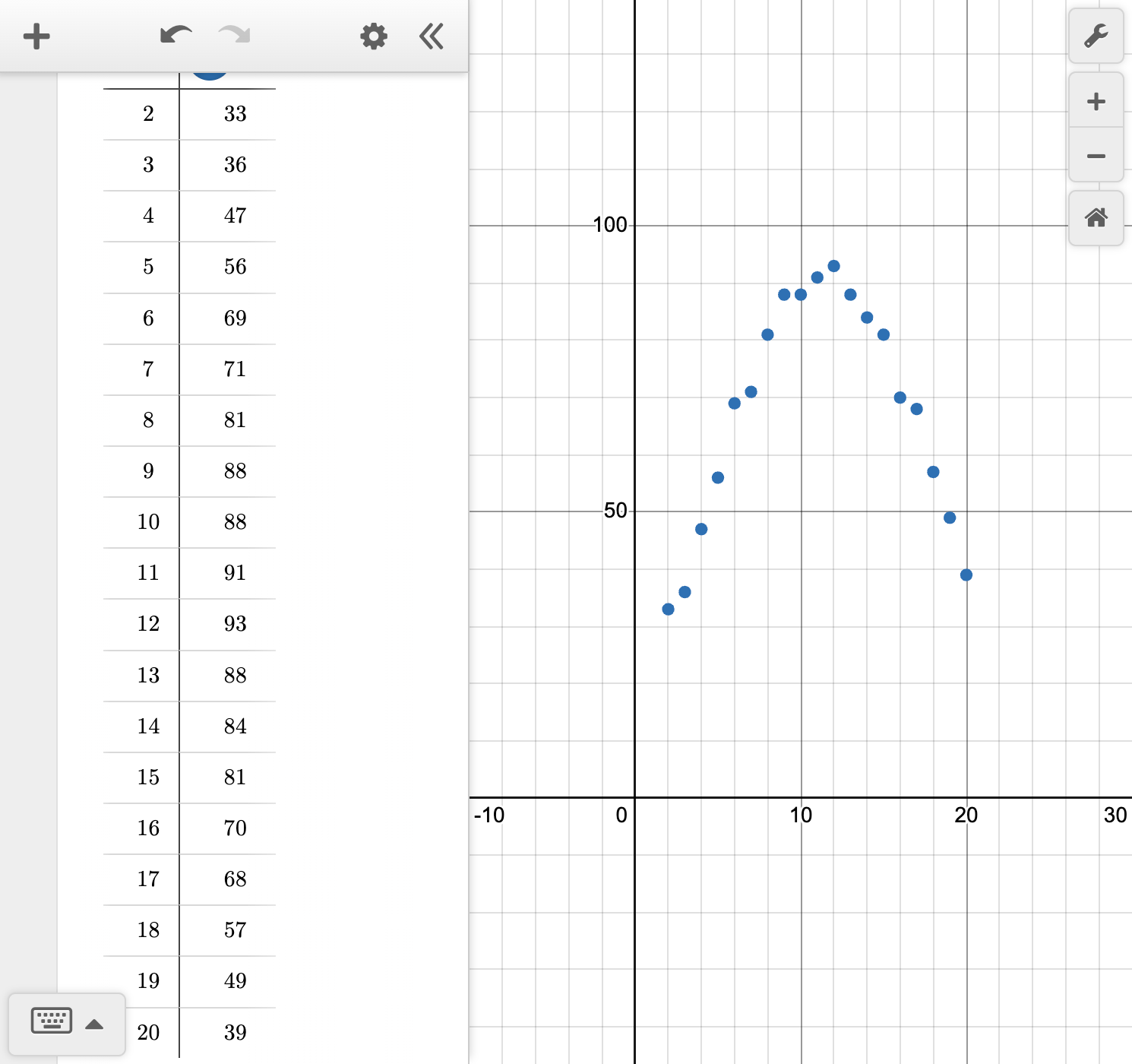
We can use technology to organize this data into a scatterplot. The distance from the hoop is the independent variable, and the percentage of shots she made is the dependent variable.

Apply the idea

Enter the x-values into one column and the y-values in a second column, then highlight the data and select Two Variable Regression Analysis.

A screenshot of the GeoGebra statistics tool showing how to construct the scatterplot of a given set of data. Speak to your teacher for more details.
d

Determine the type of model that fits the data best, and find the equation of the curve of best fit.

Worked Solution
Create a strategy

We can use either the table or the scatterplot to analyze how the y-values change as x increases. Then, we can use technology to find the equation of the curve of best fit.

Apply the idea

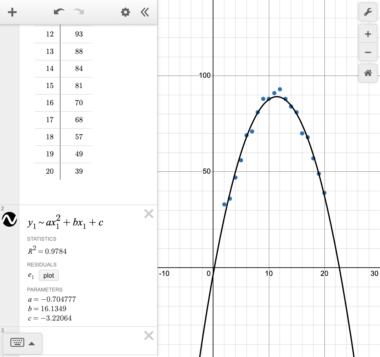
As the x-values increase, the y-values increase, reach a maximum point, then decrease. This shows the data would be best represented by a quadratic equation. Recall that quadratic functions are polynomial functions of degree 2.

Using technology, we can choose a polynomial regression model, and the degree is set to 2 by default.

A screenshot of the GeoGebra statistics tool showing how to display the curve of best fit. Speak to your teacher for more details.

The quadratic curve of best fit is y=-0.7048x^2+16.1349x-3.2206.

Reflect and check

The coefficient of determination, R^2=0.9784, shows that the model is a good representation of the data.

A screenshot of the GeoGebra statistics tool showing how to display the statistics of a given set of data. Speak to your teacher for more details.
e

Use the data to answer the statistical question from part (a).

Worked Solution
Create a strategy

Our statistical question was, "At what distances does Jocelyn make less than half of her shots?" We can use the scatterplot to find the x-values for which the y-values are less than 50.

Apply the idea

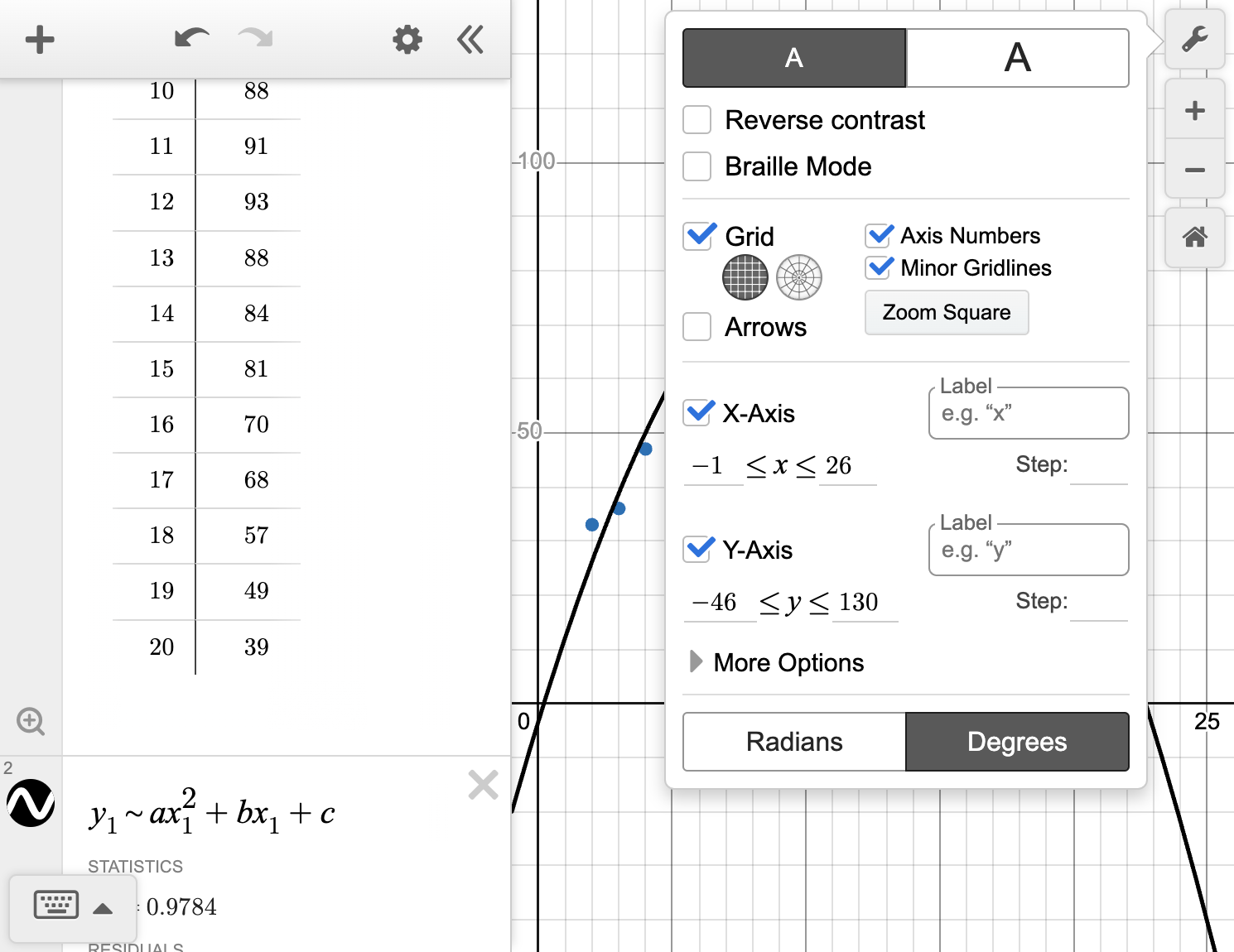
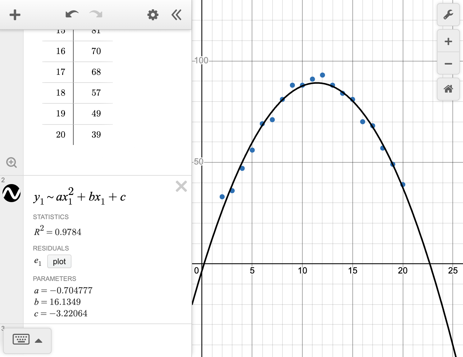
To help read the graph better, we can use the settings to adjust the axis scale and add grid lines.

A screenshot of the GeoGebra statistics tool showing how to adjust the scales used in a scatterplot. Speak to your teacher for more details.

The y-values are less than 50 when x is less than 4 or greater than 19. This means Jocelyn makes less than half of her shots when she is less than 4 feet from the hoop or more than 19 feet from the hoop.

Reflect and check

Because the coefficient of determination is high, Jocelyn can be fairly confident in this analysis. Notice that the domain of the curve is \left[2,21\right], so Jocelyn should not use this model to make predictions outside of this domain.

Idea summary

Bivariate data can be modeled by curves of best fit such as linear functions, quadratic functions, or exponential functions. We can analyze how the data changes over the domain to choose the function that is most appropriate.

The correlation coefficient, r, determines of well a linear model fits the data. R^{2} determines how strong or weak the correlation of a nonlinear model is. An R^{2} value closer to 1 represents a stronger fit.

Piecewise regression

Different functions can be used to model different situations. Sometimes, it takes a combination of functions to see the full picture. A curve of best fit may only be appropriate over a part of the domain, and we can create a piecewise function to model the data over different intervals of the domain.

A scatterplot with quadratic curve. Ask your teacher for more information.

For example, the data shown in the scatterplot does not have a linear pattern nor an exponential pattern.

If we use technology to find the quadratic curve of best fit, it does not fit the data well either.

A scatterplot with a linear line and quadratic curve. Ask your teacher for more information.

Notice that the data appears to follow a linear pattern until x=14, then it has a quadratic pattern as the x-values increase.

If we use a piecewise regression model instead, where the model is linear when x<14 and the model is quadratic when x>14, the model is a much better representation of the data.

Examples

Example 3

Loren posted a video on his social media account and noticed that the video was gaining lots of views. He collected data on the number of views the video had at the end of each day and organized it into a scatterplot, as shown.

DaysViewsDaysViews
11001116526
21321217538
32121319192
44851420537
512261523264
627791623831
768381724809
8120001827249
9133931929728
10142622029942
Views of a video over time
2
4
6
8
10
12
14
16
18
20
\text{Days}
3000
6000
9000
12000
15000
18000
21000
24000
27000
30000
\text{Number of views}
a

Is the relationship between the days and the number of views best approximated by a line, quadratic curve, exponential curve, or a combination of these functions? Explain.

Worked Solution
Create a strategy

Use the scatterplot to determine how the number of views changes over time. If the change is not consistent, consider which functions would best model the data over different subsets of the domain.

Apply the idea

Over the first 8 days, the number of views increases at an increasing rate. From 0 to 8 days, the data is best modeled by an exponential function.

After 8 days, the number of views increases at a relatively constant rate. From 8 to 20 days, the data is best modeled by a linear function.

Reflect and check

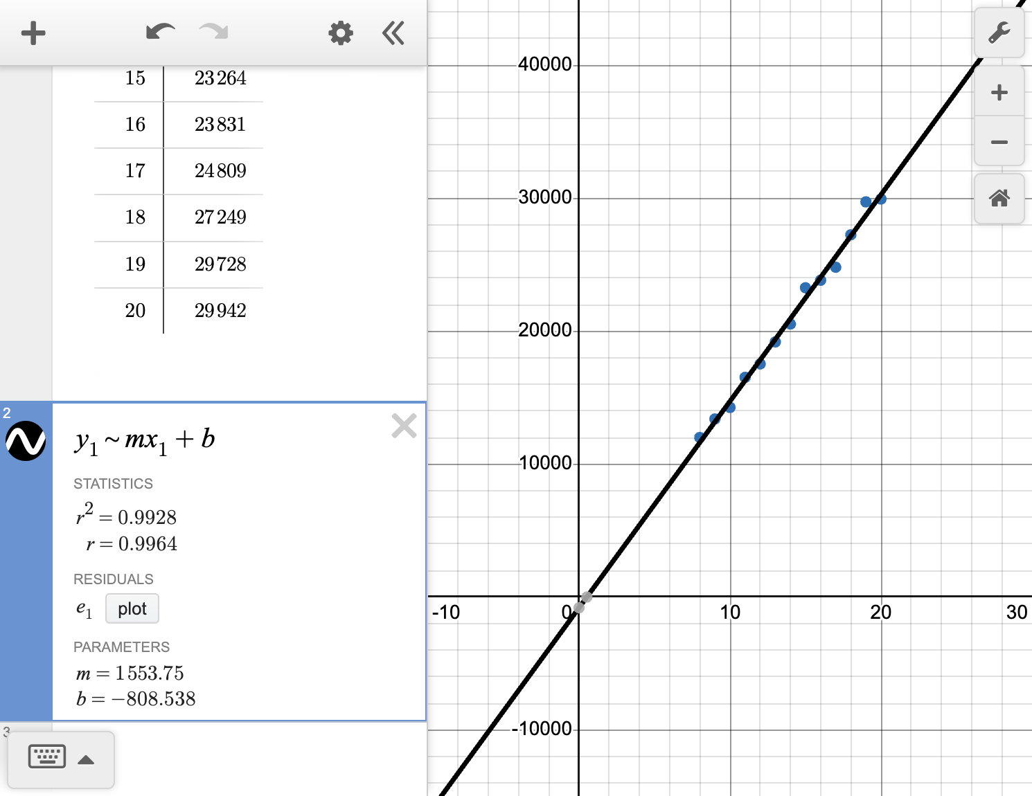
To check our answer, we can try to fit a linear, exponential, and quadratic model to the data. However, none of the best fit curves model the data well over the entire domain.

2
4
6
8
10
12
14
16
18
20
\text{Days}
3000
6000
9000
12000
15000
18000
21000
24000
27000
30000
\text{Number of views}

Line of best fit

Even though the correlation coefficient is high \left(r=0.9877\right), it does not model the data well for independent values less than 10.

It models the data from 10 days to 20 days fairly well, but we can get an even better fit if we remove the first several data values.

2
4
6
8
10
12
14
16
18
20
\text{Days}
3000
6000
9000
12000
15000
18000
21000
24000
27000
30000
\text{Number of views}

Quadratic curve of best fit

This curve does not look like a parabola because it is very zoomed in on one section of the parabola. If we zoom out, we can see the downward facing parabola take shape.

Similar to the linear model, this curve does not model the data well for independent values less than 10.

2
4
6
8
10
12
14
16
18
20
\text{Days}
3000
6000
9000
12000
15000
18000
21000
24000
27000
30000
\text{Number of views}

Exponential curve of best fit

Similar to the previous two models, this curve does not model the data very well.

b

Use your answer from part (a) to find the regression model for the data.

Worked Solution
Create a strategy

In part (a), we found that the data from 0 to 8 days should be modeled by an exponential curve of best fit, and the data from 8 to 20 days should be modeled by a line of best fit.

Using technology, we can enter each subset of data separately to find the two curves of best fit for our piecewise regression model.

Apply the idea

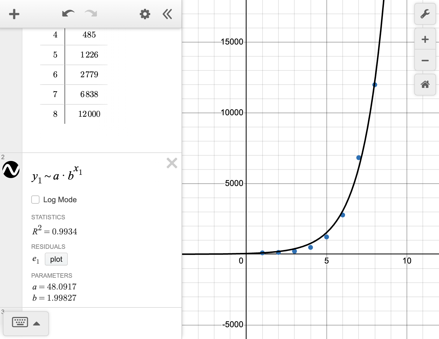
To find the exponential curve of best fit for the first subset of the domain, enter the data points on the interval 0\leq x\leq 8 into the calculator. Then, find the growth regression model.

A screenshot of the GeoGebra statistics tool showing how to display the equation of the curve of best fit. Speak to your teacher for more details.

To find the line of best fit for the second subset of the domain, enter the data points on the interval 8\leq x\leq 20 into the calculator. Then, find the linear regression model.

A screenshot of the GeoGebra statistics tool showing how to display the equation of the line of best fit. Speak to your teacher for more details.

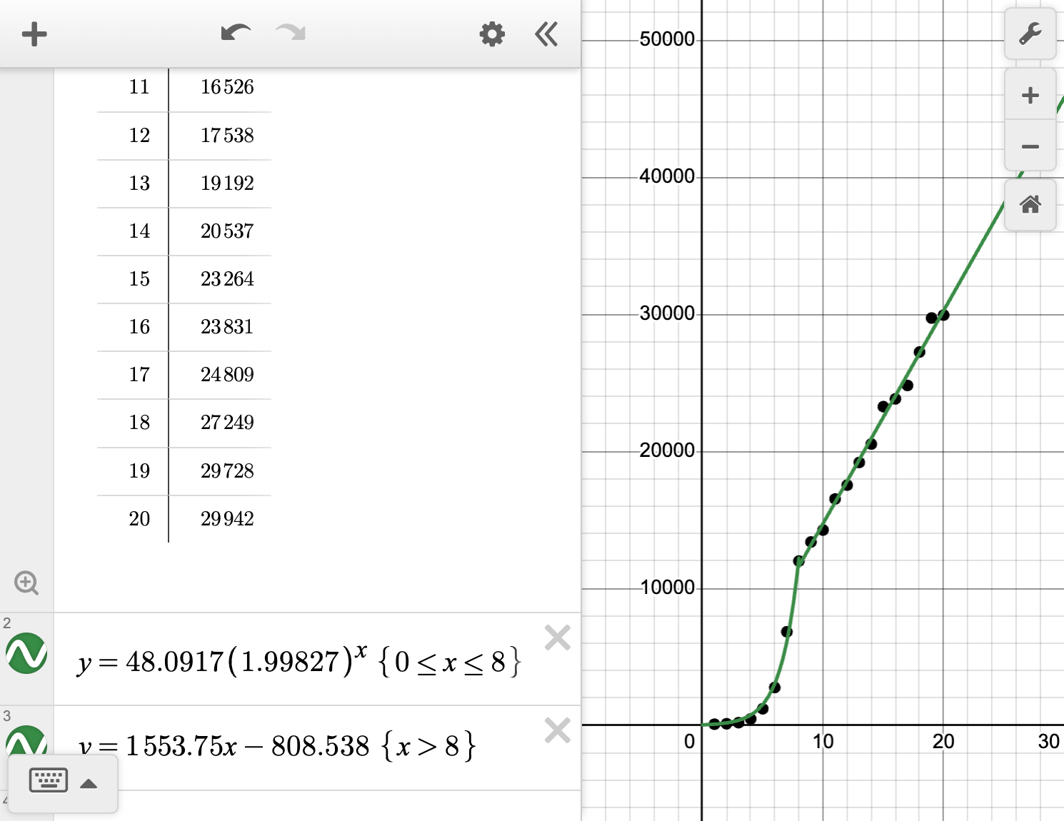
Notice that when x=8, the exponential model represents the data better. When creating the piecewise function, we will include x=8 in the domain for the exponential piece, but exclude x=8 from the domain for the linear piece.

The piecewise regression model for the data shown in the scatterplot isy=\begin{cases}32.1599\left(2.0894\right)^x, & 0\leq x\leq 8 \\1\,553.7473x-808.5385, &x\gt 8 \end{cases}

Reflect and check

If we graph the piecewise model, we can see that it represents the data much better than using a single function to model the data over the entire domain.

Views of a video over time
2
4
6
8
10
12
14
16
18
20
\text{Days}
3000
6000
9000
12000
15000
18000
21000
24000
27000
30000
\text{Number of views}
Idea summary

Piecewise functions can represent data that have different characteristics at different intervals. To find the curves of best fit in a piecewise function, we must first create a scatterplot and analyze the data. Then, we will need to determine an appropriate domain for each function type.
Outcomes

A2.ST.2

The student will apply the data cycle (formulate questions; collect or acquire data; organize and represent data; and analyze data and communicate results) with a focus on representing bivariate data in scatterplots and determining the curve of best fit using linear, quadratic, exponential, or a combination of these functions.

A2.ST.2a

Formulate investigative questions that require the collection or acquisition of bivariate data and investigate questions using a data cycle.

A2.ST.2b

Collect or acquire bivariate data through research, or using surveys, observations, scientific experiments, polls, or questionnaires.

A2.ST.2c

Represent bivariate data with a scatterplot using technology.

A2.ST.2d

Determine whether the relationship between two quantitative variables is best approximated by a linear, quadratic, exponential, or a combination of these functions.

A2.ST.2e

Determine the equation(s) of the function(s) that best models the relationship between two variables using technology. Curves of best fit may include a combination of linear, quadratic, or exponential (piecewise-defined) functions.

A2.ST.2f

Use the correlation coefficient to designate the goodness of fit of a linear function using technology.

A2.ST.2g

Make predictions, decisions, and critical judgments using data, scatterplots, or the equation(s) of the mathematical model.

A2.ST.2h

Evaluate the reasonableness of a mathematical model of a contextual situation.

What is Mathspace

About Mathspace