8.04 Lines of best fit
We have already learned to create a scatter plot and to perform analysis such as determining correlation. Another type of analysis we may choose to do to the graph of a scatter plots is to identify a line of best fit.
Correlation
We describe the correlation from data using language like positive correlation, negative correlation or no correlation. We might even say that two variables have strong or weak correlation.
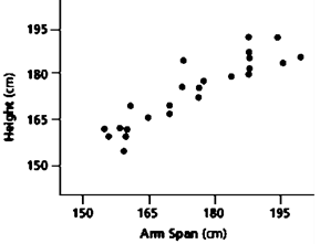
Positive correlation - the data appears to gather in a positive relationship, similar to a straight line with a positive slope.
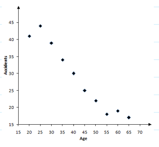
Negative correlation - is when the data appears to gather in a negative relationship, similar to a straight line with a negative slope.
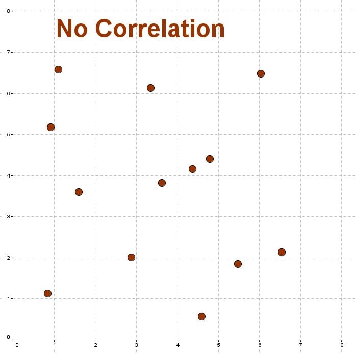
No correlation - when there is no relationship between the variables we say they have no correlation.
Below are some examples of scatter plots with different correlations:
 |
 |
 |
| Positive correlation | Negative correlation | No correlation |
The more closely the plotted data resembles a straight line, the stronger the correlation is between the variables.
Just because two variables have a correlation, even a strong one, does not mean that one causes the other. For example, there is a strong correlation between height and stride length. However, it doesn't mean that if you take big steps you'll grow taller!
Lines of best fit
A line of best fit (sometimes called a trend or regression line) is a straight line that best represents the data on a scatter plot. Depending on the strength of the correlation, this line may pass exactly through all of the points, some of the points, or none of the points. However, it always represents the general trend of the of the data.
Lines of best fit are really handy as we can use them to help us make predictions or conclusions about the data.
To draw a line of best fit by eye, balance the number of points above the line with the number of points below the line. You should generally ignore outliers (points that fall very far from the rest of the data) as they can skew the line of best fit. Later we will look at how we can calculate a line of best fit's equation.
Below is an example of what a good line of best fit might look like.

Making predictions
If the points appear to lie close to a line, we conclude that a relationship probably exists and it is safe to make predictions using a line of best fit. Making predictions inside the range of the data is called interpolation.
In a well-designed experiment, a researcher is careful not to use the fitted line to make predictions about the response that would be observed to values of the independent variable that are outside the range of the values used in the experiment. For example, if in the experiment the smallest value of the independent variable was 10 and the largest 85, then it would be unwise to try to predict what the response would be when the independent variable was smaller than 10 or larger than 85.
To make such predictions beyond the range of the data is called extrapolation and is considered unsafe.
Worked example
Question 1
The data points illustrated in the graph below show the sale price of an item of goods measured against the age of the item. Given the value of either the independent or dependent variable, we can determine the corresponding value using the line of best fit as seen below.

The regression line can be used to predict that at 23 months the value of the goods will be approximately $\$1250$$1250. Considering the amounts by which the data points are above and below the regression line, it could easily happen that the estimated value of the goods at 23 months is $\$100$$100 too low or too high.
Practice questions
Question 2
The following scatter plot shows the data for two variables, $x$x and $y$y.

Determine which of the following graphs contains the line of best fit.
A scatter plot with an $x$x-axis labeled from $0$0 to $10$10 and a $y$y-axis labeled from $0$0 to $10$10. Both axes are in increments of $1$1 unit. Gray gridlines divide the plane into square units. Nine points are plotted on the grid: $\left(1,2\right)$(1,2), $\left(2,1\right)$(2,1), $\left(3,3\right)$(3,3), $\left(4,5\right)$(4,5), $\left(5,6\right)$(5,6), $\left(6,5\right)$(6,5), $\left(7,7\right)$(7,7), and $\left(8,7\right)$(8,7). A green line passes through the graph at an upward diagonal slope that follows the trend of the points, starting at point approximately $coord(0,0.7)$coord(0,0.7) and extending near the top-right corner at point approximately $coord(10,9.2)$coord(10,9.2). Points $\left(1,2\right)$(1,2),$\left(4,5\right)$(4,5),$\left(5,6\right)$(5,6), and $\left(7,7\right)$(7,7) are above the green line, while points $\left(2,1\right)$(2,1), $\left(3,3\right)$(3,3), $\left(6,5\right)$(6,5) and $\left(8,7\right)$(8,7) are below the green line. The points are plotted as solid blacks dots but the coordinates are not explicitly labeled nor stated in this problem. AA scatter plot with an $x$x-axis labeled from $0$0 to $10$10 and a $y$y-axis labeled from $0$0 to $10$10. Both axes are in increments of $1$1 unit. Gray gridlines divide the plane into square units. Nine points are plotted on the grid: $\left(1,2\right)$(1,2), $\left(2,1\right)$(2,1), $\left(3,3\right)$(3,3), $\left(4,5\right)$(4,5), $\left(5,6\right)$(5,6), $\left(6,5\right)$(6,5), $\left(7,7\right)$(7,7), and $\left(8,7\right)$(8,7). A green line passes through the graph at an upward diagonal slope, starting at point approximately $coord(0,1.1)$coord(0,1.1) and extending near the top-right corner at point approximately $coord(10,9.7)$coord(10,9.7). Point $\left(1,2\right)$(1,2) lies on the green line, while points $\left(4,5\right)$(4,5), and $\left(5,6\right)$(5,6) are above the green line, and points $\left(2,1\right)$(2,1), $\left(3,3\right)$(3,3), $\left(6,5\right)$(6,5), $\left(7,7\right)$(7,7) and $\left(8,7\right)$(8,7) are below the green line. The points are plotted as solid blacks dots but the coordinates are not explicitly labeled nor stated in this problem. BA scatter plot with an $x$x-axis labeled from $0$0 to $10$10 and a $y$y-axis labeled from $0$0 to $10$10. Both axes are in increments of $1$1 unit. Gray gridlines divide the plane into square units. Nine points are plotted on the grid: $\left(1,2\right)$(1,2), $\left(2,1\right)$(2,1), $\left(3,3\right)$(3,3), $\left(4,5\right)$(4,5), $\left(5,6\right)$(5,6), $\left(6,5\right)$(6,5), $\left(7,7\right)$(7,7), and $\left(8,7\right)$(8,7). A green line passes through the graph at an upward diagonal slope, starting at point approximately $coord(0,0.1)$coord(0,0.1) and extending near the top-right corner at point approximately $coord(10,8.8)$coord(10,8.8). Point $\left(8,7\right)$(8,7) lies on the green line, while points $\left(1,2\right)$(1,2), $\left(3,3\right)$(3,3), $\left(4,5\right)$(4,5), $\left(5,6\right)$(5,6), and $\left(7,7\right)$(7,7) are above the green line, and points $\left(2,1\right)$(2,1), and $\left(6,5\right)$(6,5) are below the green line. The points are plotted as solid blacks dots but the coordinates are not explicitly labeled nor stated in this problem. CA scatter plot with an $x$x-axis labeled from $0$0 to $10$10 and a $y$y-axis labeled from $0$0 to $10$10. Both axes are in increments of $1$1 unit. Gray gridlines divide the plane into square units. Nine points are plotted on the grid: $\left(1,2\right)$(1,2), $\left(2,1\right)$(2,1), $\left(3,3\right)$(3,3), $\left(4,5\right)$(4,5), $\left(5,6\right)$(5,6), $\left(6,5\right)$(6,5), $\left(7,7\right)$(7,7), and $\left(8,7\right)$(8,7). A green line passes through the graph at an upward diagonal slope but does not follow the trend of the points, starting at point approximately $coord(0,1.5)$coord(0,1.5) and extending near the top-right corner at point approximately $coord(10,8.2)$coord(10,8.2). Points $\left(4,5\right)$(4,5),$\left(5,6\right)$(5,6), $\left(7,7\right)$(7,7) and $\left(8,7\right)$(8,7) are above the green line, while points $\left(1,2\right)$(1,2), $\left(2,1\right)$(2,1), $\left(3,3\right)$(3,3) and $\left(6,5\right)$(6,5) are below the green line. The points are plotted as solid blacks dots but the coordinates are not explicitly labeled nor stated in this problem. DUse the line of best fit to estimate the value of $y$y when $x=4.5$x=4.5.
A scatter plot with an $x$x-axis labeled from $0$0 to $10$10 and a $y$y-axis labeled from $0$0 to $10$10. Both axes are in increments of $1$1 unit. Gray gridlines divide the plane into square units. Nine points are plotted on the grid: $\left(1,2\right)$(1,2), $\left(2,1\right)$(2,1), $\left(3,3\right)$(3,3), $\left(4,5\right)$(4,5), $\left(5,6\right)$(5,6), $\left(6,5\right)$(6,5), $\left(7,7\right)$(7,7), and $\left(8,7\right)$(8,7). A green line with an equation of $y=(78/90)*x+(54/90)$y=(78/90)*x+(54/90) passes through the graph at an upward diagonal slope that follows the trend of the points. The equation of the line is not explicitly given nor stated in the graph and problem. Points $\left(1,2\right)$(1,2),$\left(4,5\right)$(4,5),$\left(5,6\right)$(5,6), and $\left(7,7\right)$(7,7) are above the green line, while points $\left(2,1\right)$(2,1), $\left(3,3\right)$(3,3), $\left(6,5\right)$(6,5) and $\left(8,7\right)$(8,7) are below the green line. The points are plotted as solid blacks dots but the coordinates are not explicitly labeled nor stated in this problem. $4.5$4.5
A$5$5
B$5.5$5.5
C$6$6
DUse the line of best fit to estimate the value of $y$y when $x=9$x=9.
$6.5$6.5
A$7$7
B$8.4$8.4
C$9.5$9.5
D
Question 3
The number of fish in a river is measured over a five year period.
The results are shown in the following table and plotted below.
| Time in years ($t$t) | $0$0 | $1$1 | $2$2 | $3$3 | $4$4 | $5$5 |
|---|---|---|---|---|---|---|
|
Number of fish ($F$F) |
$1903$1903 | $1998$1998 | $1900$1900 | $1517$1517 | $1693$1693 | $1408$1408 |
Which line best approximates the data?
Loading Graph...ALoading Graph...BLoading Graph...CLoading Graph...DUse this line to predict the number of years until there are no fish left in the river.
Now predict the number of fish remaining in the river after $7$7 years.
Predict how long it will be before there are $900$900 fish left in the river.


